Mastering Animations in Figma by Building 7 Common UI Animations

Most designers will spend many hours perfecting every pixel of their static UI designs but will barely spend any time perfecting the transitions between these pages.
When you design a mobile menu you design both states, the opened menu and the closed menu. But if a user clicks to open the menu, does it just suddenly appear? Does it slide in? From what side? How fast? Is the animation linear or does it ease in and/or out?
There are many ambiguities if you just supply the developer implementing the design with two static screens. Adding a one-line note to it that says "it slides in" is not nearly detailed enough.
Motion plays an important role in your designs and can help the user understand what's happening when they interact with and navigate around your app.
We'll cover some of the most common animations found in apps and websites today and how to implement each one into your designs using Figma.
The Basics
Feel free to skip this section if you are familiar with the basics of animation in Figma and want to go straight to the examples.
First, let's start with the basics of how animation in Figma works.
To add a transition from one screen to another in Figma you'll need to create a connection between two frames, a trigger that starts the transition, and an animation type to shape what the transition between the frames will look like.
Figma has a variety of animations and interactions to choose from and we'll take a look at which ones you can use to replicate the most common animations on the web and in mobile apps.
Smart Animate
Figma also has a 'special' animation type called Smart Animate which tries to automatically figure out how to best transition between two states using layer names and hierarchy.
Layer names play an important role in Figma's Smart Animate to determine which layers change and how they change. Make sure the layers in both compositions match exactly so Figma can keep track of them correctly.
You can rename one or multiple layers by pressing using the keyboard shortcuts:
- Mac: Command ⌘ + R
- Windows: Ctrl + R
To check if Figma can correctly track a layer across compositions, open the prototype tab in the sidebar and Figma will automatically highlight the layers in other frames that will be matched by Smart Animate by adding a purple border.

You can also choose to apply another animation type and enable Smart Animate for only the matching layers. Figma will then apply your animation only to the layers that should be updated.
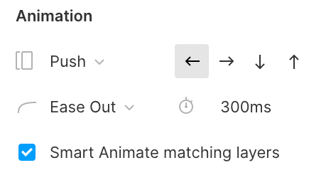
If you do not check this option, the animation will be applied to the entire composition including layers that do not change. This will result in also applying the animation to common elements like the iOS or Android status bar which should not animate when navigating to a different page.
Important: All of these examples are available in Figma so you can test and experiment with each demo yourself.
#1 Hamburger Menu
Almost every (mobile) website and app has one, the infamous hamburger menu. Luckily this one is super easy to create in Figma using the Smart Animate feature.
How To Create This Animation
All we have to do is to create two versions of it like we normally would when designing a hamburger menu. One with the menu in a closed state and one with the menu in an opened state.
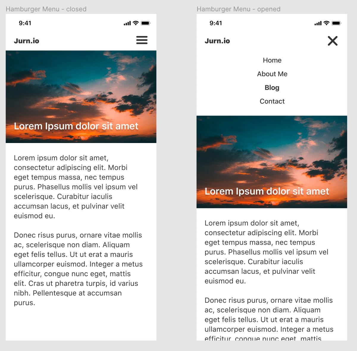
We'll then add the connection, trigger and animation as explained in the basics.
- Select the hamburger icon in the first frame and open the prototype tab in the right sidebar. Select On Tap as the interaction to set the animation trigger.
- Set the interaction to Navigate To and select the other frame with the mobile menu in an opened state or click on the node and drag it to the next frame.
- In the Animation section, select Smart Animate from the Transition Field.
- (optional) Apply Easing or change the Duration of the transition.
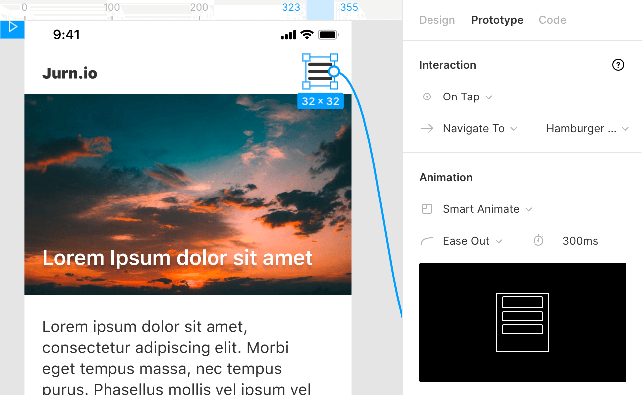
You can now open the menu but we haven't set the trigger to be able to close the menu again.
Repeat the previous steps on the second frame but set Navigate To back to the frame with the menu in the closed state.
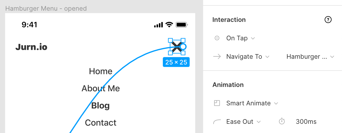
That's it! You can then go to test the animation by clicking the play icon in the top right of Figma to open presentation view. You can now open and close the hamburger menu and see the transition between the two states.
#2 Sliding Tabs
Tabs are a very common design pattern, especially in mobile apps. Having no animation when switching tabs makes the transition feel very sudden. By positioning the new tab content relative to the action that opens it we can show continuity in the transition between the tabs. This helps the user make sense of where the information comes from.
How To Create This Animation
To create this animation we'll first make the two static UI screens with tabs that we can navigate between.
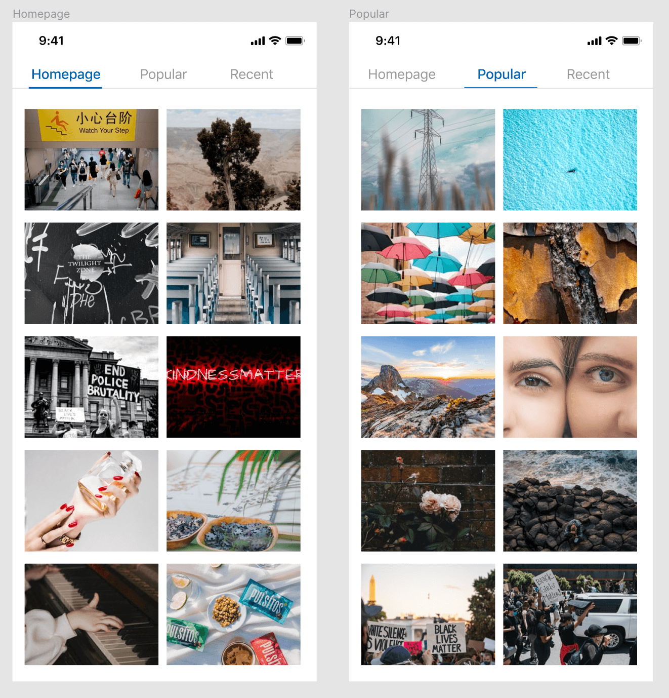
The user needs to be able to transition between the tabs in two ways, by clicking the tab title and by swiping between pages, so we'll add two animation triggers.
One for tapping the tab title and one for swiping between the different tabs.
Let's start with the first the trigger; clicking on the tab title.
- Select the tab title layer and open the Prototype tab again in the sidebar. Select On Tap as the interaction to set the animation trigger.
- Set the interaction to Navigate To and select the screen with the other tab.
- In the Animation section, select Push from the Transition Field and select the Left arrow. As the new tab is position on the right of our current tab, we want it to push from right to left.
- Make sure Smart Animate matching layers is checked. That way Figma doesn't apply the transition to the elements that both frames have in common, such as the background of the tab or the phone status bar.
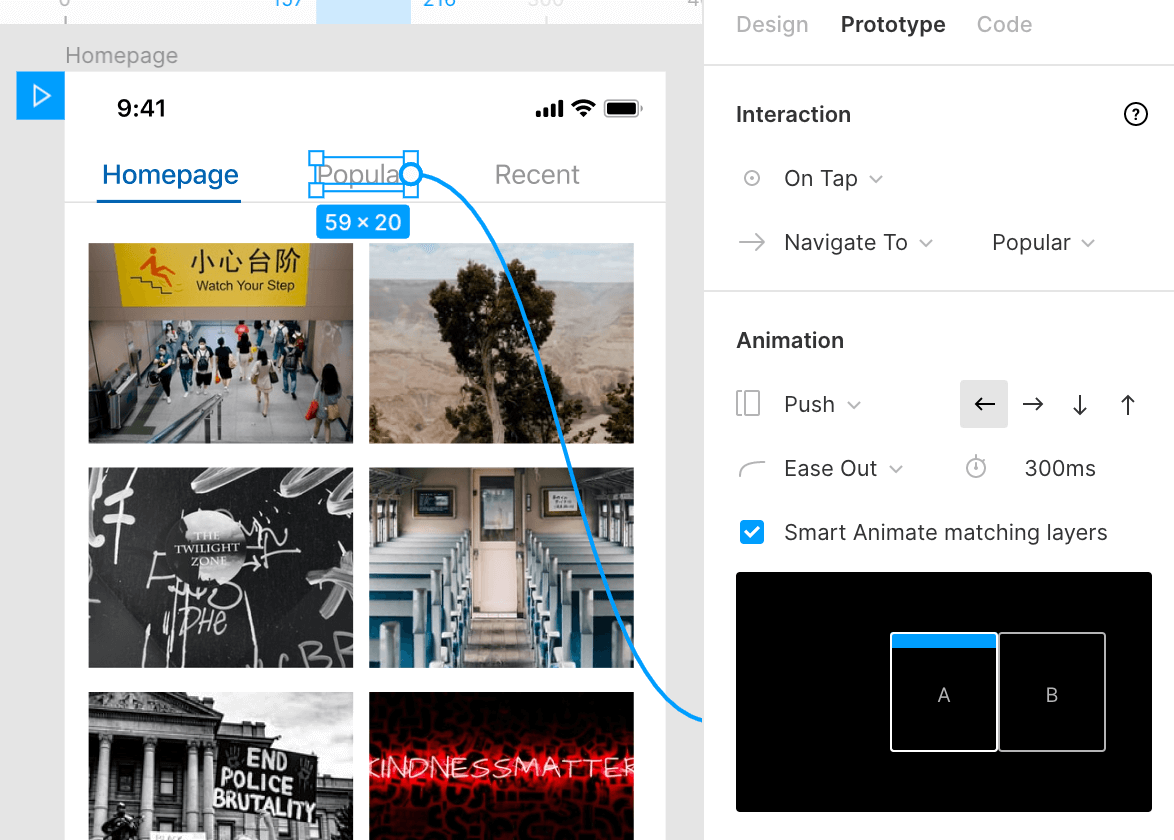
For this transition to work however, it's very important that the actual tab content isn't smart matched by Figma as Smart Animate will otherwise override our push animation with a fade animation because of the matching of layers.
To prevent this from happening we need to make sure the layer names for these do not match. You don't have to rename each individual layer but instead, you can simply group them and rename the group (e.g. homepage content and popular content).
Now that we've set up the first trigger we can move on to adding the ability to swipe between tabs.
- For this, we'll select the entire group that makes up the tab content and add the On Drag trigger.
- Set the interaction to Navigate To and select the screen with the other tab.
- We can use the same animation settings as the first trigger. In the Animation section, select Push from the Transition Field but this time we'll select the Right Arrow. As the tab we want to navigate to is now on our left.
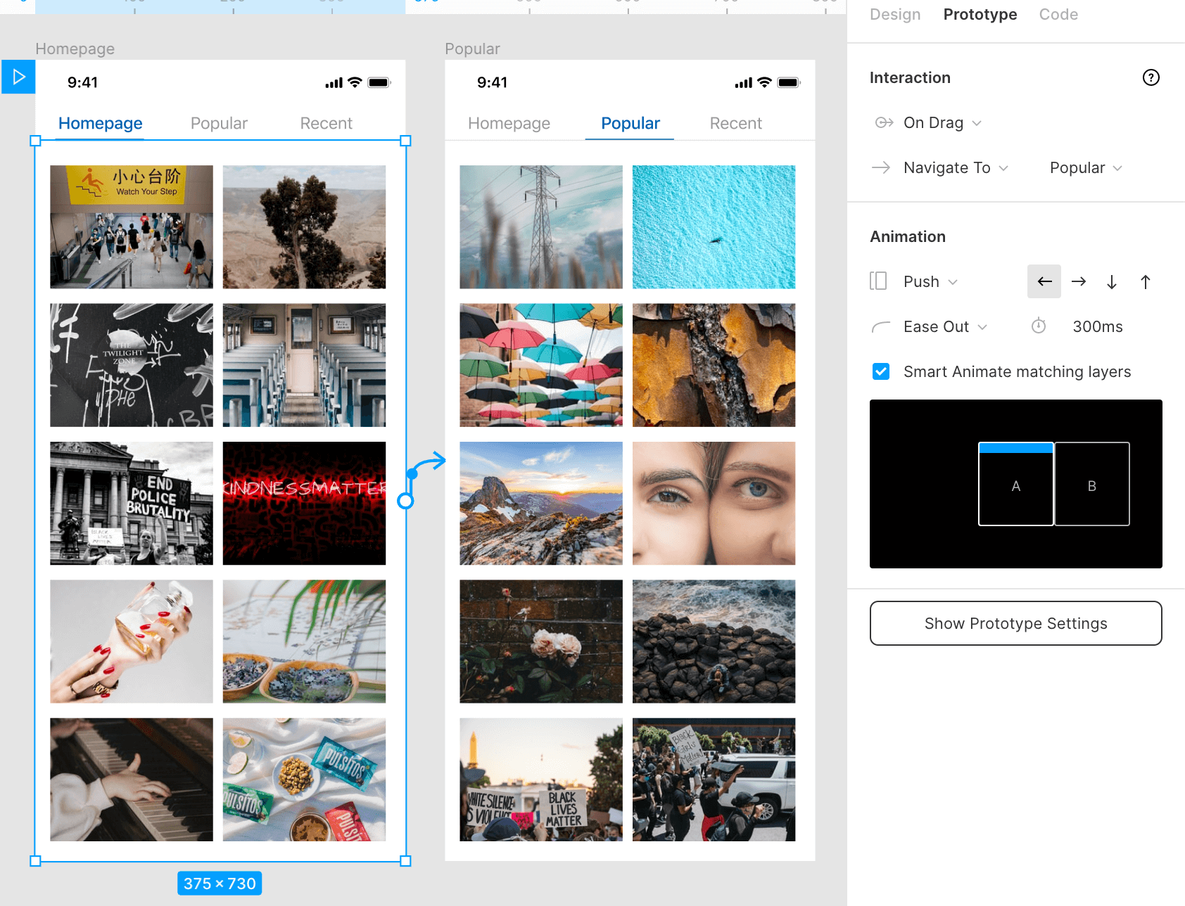
Both swiping and tapping on the tab title will now work for the first tab but we can't yet navigate back to the homepage so we'll need to add the same triggers for the Popular tab.
All of the settings for these triggers are the same except we'll reverse the direction in the animation settings as the direction is now reversed.
#3 Loading screens
Apps and websites need to load content and this might take some time, especially for users on slow connections or when loading big files.
To improve the user experience, a lot of apps and websites display a skeleton loading screen while the data is being downloaded. This helps to make the loading feel faster to the user and show them the status of the interface.
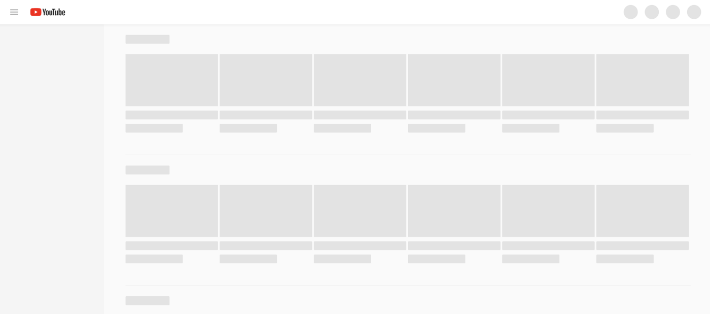
Loading states are often forgotten by designers but a thoughtfully designed loading state can greatly improve the user experience.
We'll recreate our previous sliding tabs animation but this time we'll simulate a loading state by showing a skeleton screen before showing the actual page content.
How To Create This Animation
First, let's copy the design used in our previous sliding tab animation. We'll then add an extra frame in between that contains our loading state design.
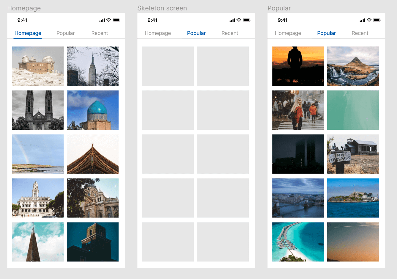
- Now we can add the same triggers and animations as before, but instead of going straight to the 'Popular' tab. Set it to Navigate To and select the frame with the loading state.
- On the frame with our loading state. Select the After Delay trigger and set it to Navigate To the next frame in the sequence. In this case it's the Popular tab. You can set the delay to as long as you want, in our animation it will wait 800ms before it's 'finished' loading and the content is visible.
- Set the Animation to Smart Animate so the skeleton screen is replaced by the actual content with a smooth fade transition.
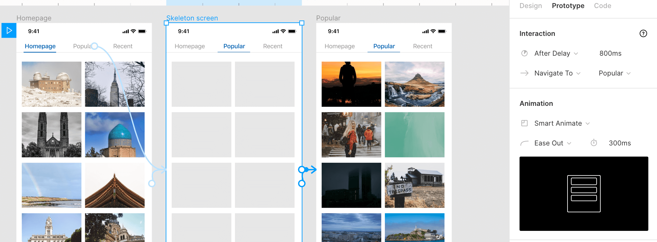
The same After Delay transition can be applied to a variety of situations where a user might encounter a loading or processing state.
A splash screen when you open an app, when a credit card purchase is being processed, or when a user is uploading files or after submitting a form.
#4 Page Transitions
Over the years, apps have become a lot more complex in flow and hierarchy than just loading a new page on every link. We regularly 'layer' content on top of other content, especially in single-page apps (SPA's). That means we don't do full page loads but instead move content in and out in different directions and want to model that in our designs.
We'll make an animation where the content moves in from the bottom which we can then swipe away like it's an overlay.
How To Create This Animation
We'll create an animal directory with a page for every animal. Important for making this transition is that the layer name of the page content matches so Figma can match these using Smart Animate.
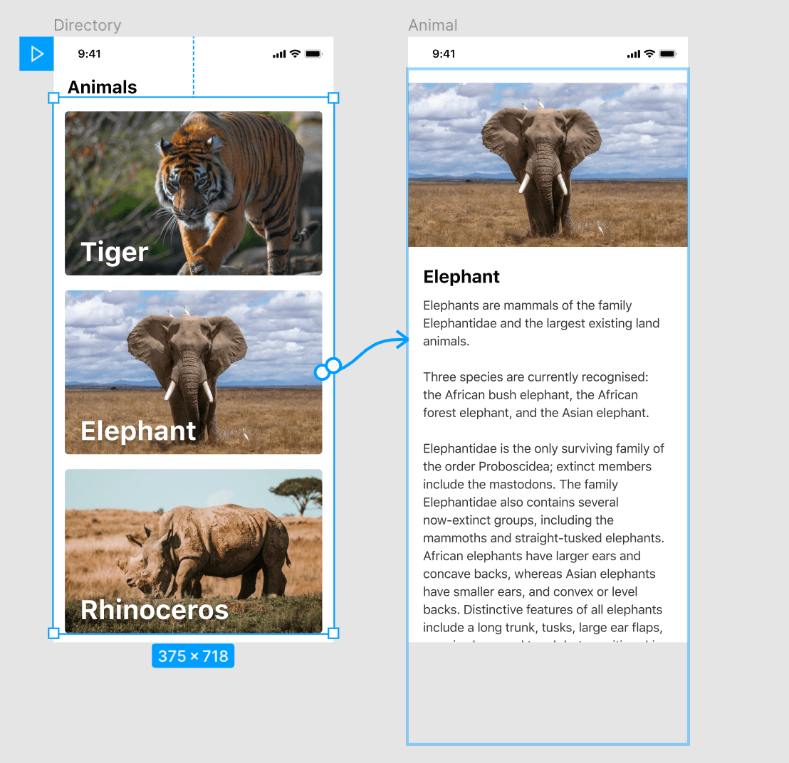
- Select one of the animal blocks, in this case, the elephant, and set the trigger to On Tap and Navigate To the corresponding animal page.
- Set the transition type to Smart Animate. You can tweak the easing settings and speed but this is optional.
If you made sure the layers are correctly matched then it will now slide in the new page from the bottom.
Swipe to close
To then be able to swipe away the page we'll need to add a trigger and transition for that to happen on the animal page.
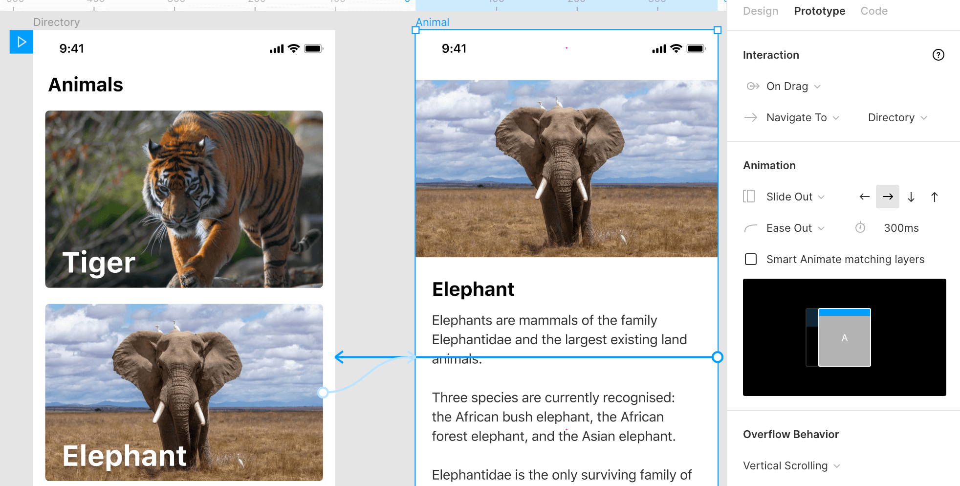
- Select the page content, add the On Drag trigger and set it to Navigate To our animal directory page.
- In the Animation tab, select the Slide Out transition and select the Right Arrow so we can swipe in the right direction to close it.
- Leave the Smart Animate matching layers option unchecked as we want to swipe the entire page away instead of having a smooth transition between the two pages.
#5 Pull to Refresh
This one speaks for itself. A very common UI pattern when refreshing a page or fetching new content, especially in feeds for news, mail and social media.
How To Create This Animation
At first, it seems like a very complex animation to create in Figma but once you break it down into smaller steps, it's much easier to understand what's going on.
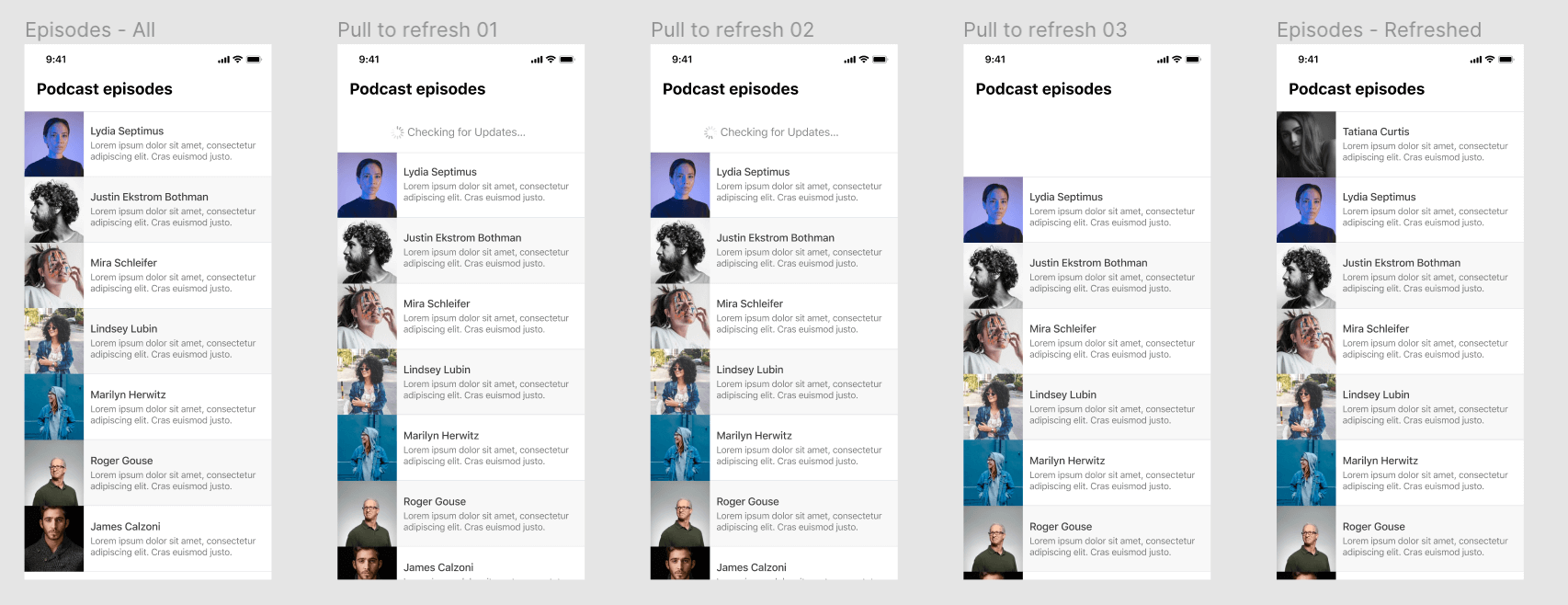
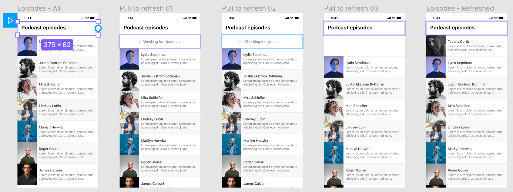
We'll start out with a list of podcast episodes. To enable this animation we'll need to turn this entire group of layers into a frame. By turning it into a frame instead of a group of layers we can make the content of this frame bigger than the dimensions of the frame to allow vertical scrolling.
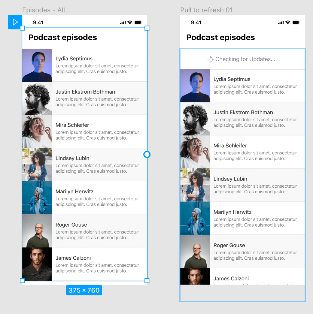
The "Checking for Updates" content is already in the first frame, although it's not yet visible as it's hidden behind the page title.
Frame 1 to frame 2
We'll set the first frame in our sequence to On Drag and Navigate To the second page in our sequence 'Pull to refresh 01'. In this second frame we'll make a duplicate of the first frame but move the content down so the "Checking for Updates" group is now in view.
Frame 2 to frame 3
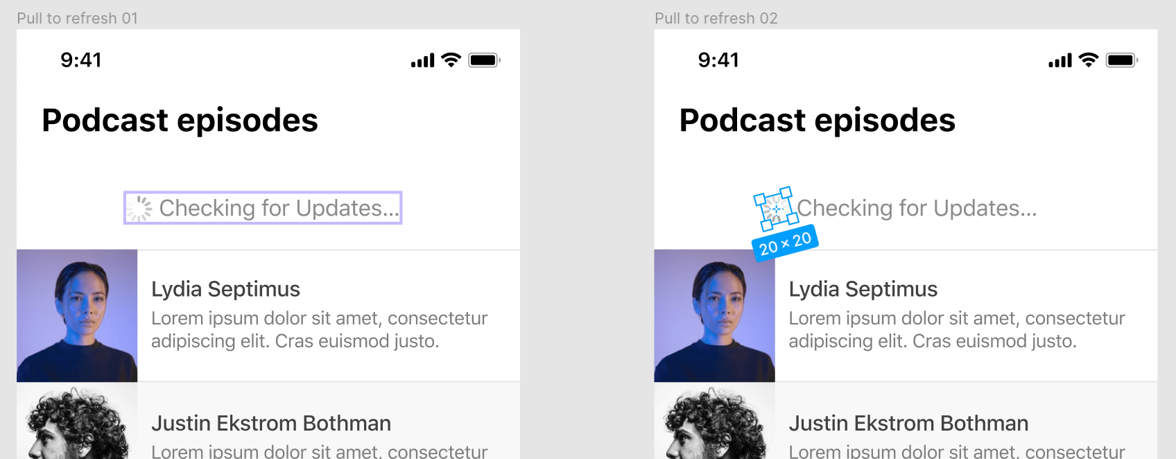
In the second frame of our sequence, we'll simulate a loading animation. This isn't strictly necessary but makes the sequence of actions feel more like a finished product instead of static UI screens that are stitched together.
We'll duplicate the second frame for the third frame but in the 3rd frame, we'll set the rotation to the spinner to -165°.
For the transition between these two frames, we'll use After Delay and set it to navigate to the third frame in our sequence after 500ms. We'll set the transition to Smart Animate and use Ease In as the type of transition with a delay of 500ms. The delay for loading the next frame and the transition are the same.
Frame 3 to frame 4
In this frame, we'll create space for new content that will be loaded. This step makes the animation a lot smoother instead of the content just appearing out of nowhere. Don't remove the "Checking for Updates" group completely but move it behind the page title like it was in the first frame and leave the exact amount of vertical space that is required for the new content.
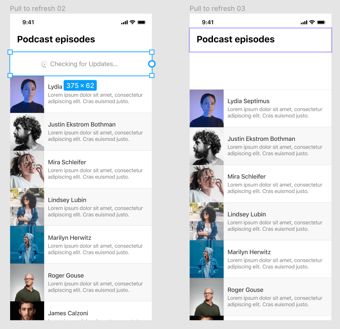
To make it look like the data was fetched and is being loaded in we'll set up another After Delay and Navigate To the next frame after a delay of 1000ms.
For the Animation, we'll use the Dissolve transition so the "Checking for Updates" status disappears. We'll use a shorter duration of 100ms for this animation so it disappears fast.
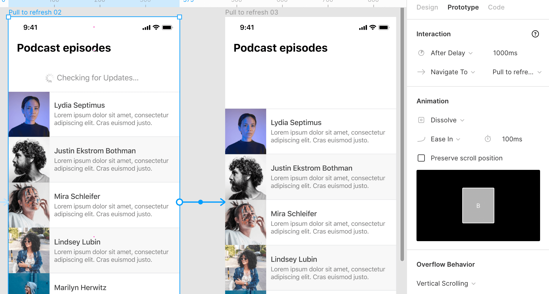
Frame 4 to Frame 5
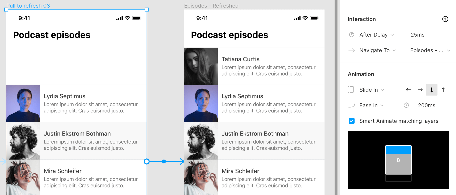
All that's left is to show the newly loaded content in the space we created in our previous frame. Add the new content in the last frame and set up another After Delay with a very short 25ms delay before navigating to the last frame.
Since the users swipes down the refresh it looks more natural if the content slides in from the top so we'll set the Animation to Slide In and choose the Down Arrow so the new content slides down into view. We can add a 200ms duration for this transition.
#6 Swipe Actions
Another common UI pattern we see in mobile apps is swiping items left or right to reveal more actions. For example, in email apps, this pattern is often applied to mark emails as read or unread, reply or delete them.
How To Create This Animation
To prototype this in Figma we'll create two designs. One in the 'normal' state and one where the actions are visible. For the latter, it's very important that the action does not overlap but 'pushes' the old content because, just like with the pull to refresh animation, we need to have the content exceed the frame size to enable scrolling.
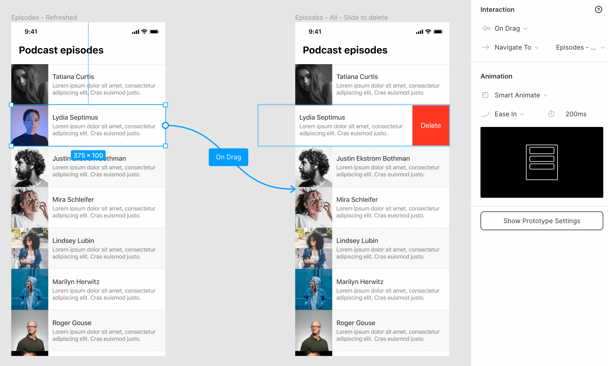
- Select the element you want to enable the action on and select the On Drag trigger, then set it to Navigate To the second view where the actions are visible.
- For the Animation, select Smart Animate, and Figma will automatically know how to transition between these two states.
Once the actions are visible we need to give the user two options, to cancel the action or to perform the action. We'll create a trigger for each one, clicking on the podcast episode cancels the action. Clicking on the delete button will navigate to the next frame in the sequence.
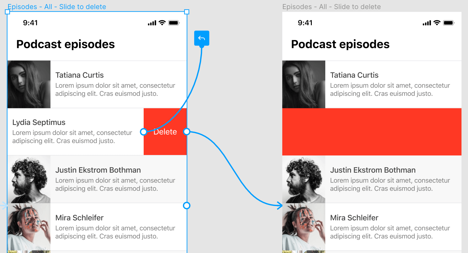
For canceling the action: Select the entire item excluding the delete button. Set the trigger to On Tap and simply select Back in the actions dropdown to go back to the previous frame.
To delete the element: Select the delete button, select the On Tap trigger, set it to Navigate To, and select the next frame in the sequence. The animation type is Slide In and select the Left Arrow, the same direction as our swipe to reveal the delete button. Note that you can simply navigate to the next frame where the item is gone but to make this transition look better I'll first make the entire row red to show which item was deleted.
For the last frame, we simply add the After Delay trigger again and set it to Navigate To the last frame where the item is deleted after a delay of 100ms.
We can use Smart Animate again to transition between these two frames.
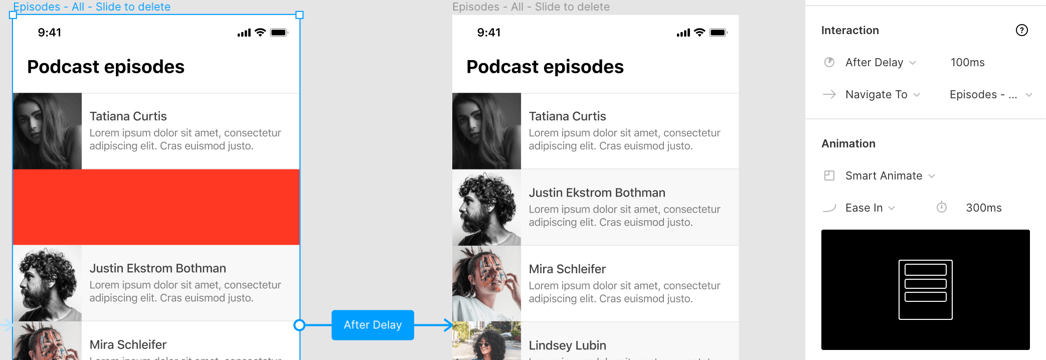
Now the sequence is complete and you can preview the animation in prototype mode!
#7 Modal
Modals are widely used in apps and websites for everything from offering discounts to paywalls to confirmation dialogs. Learning how to add these to your prototypes will come in handy in a lot of design projects.
How To Create This Animation
Unlike what I see most designers doing when they create modals, you don't have to duplicate the complete design multiple times to add a modal to each one.
You can create a separate frame that contains the modal design and add it using Figma's prototyping tools. This saves a lot of clutter in your design files, especially when you are working with modals that have multiple steps.
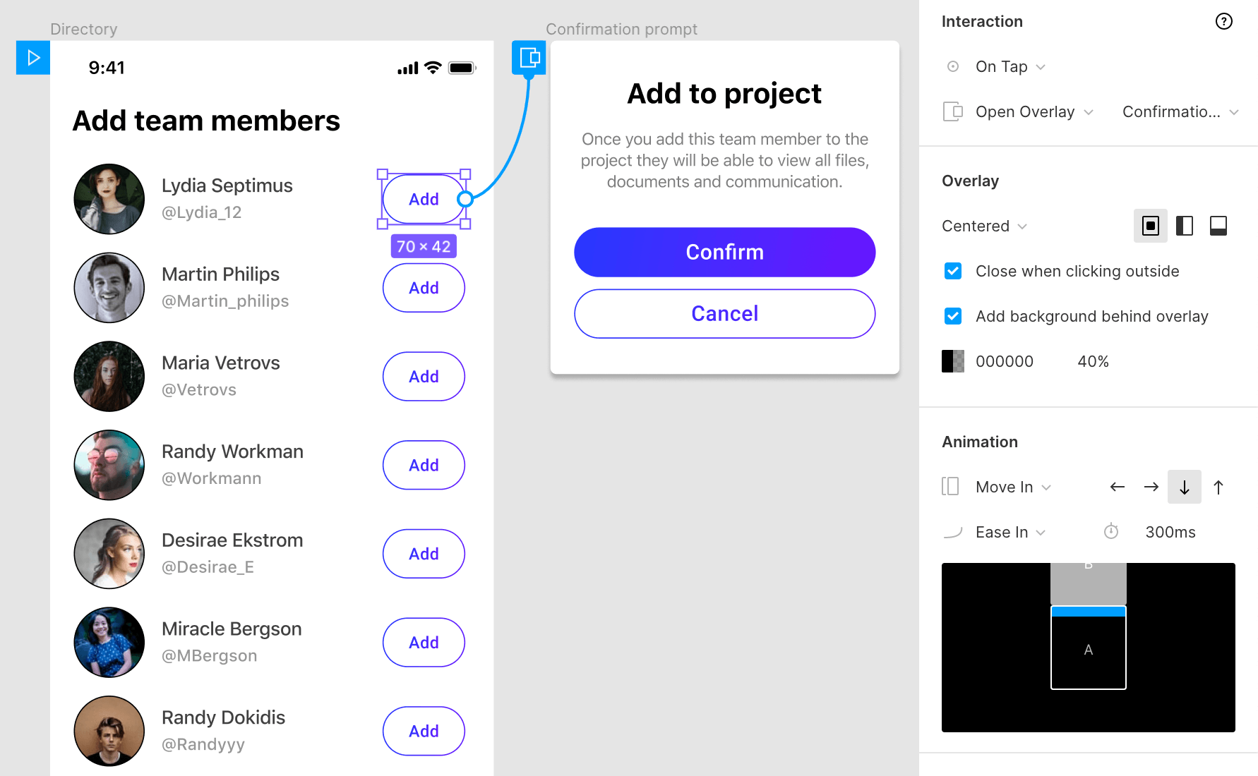
- Select the button or link that you want to use to trigger the modal opening. Select the On Tap trigger and use Open Overlay to link it to the frame that contains your modal.
- In the Overlay section, you can choose the settings for your modal. In this case, we'll go with the Centered position and check the Close when clicking outside option.
- Next, make sure the Add background behind overlay option is checked. We'll set the background to black (#000) and use 40% opacity. This helps the modal stand out and shows the user the rest of the page is not accessible while the modal is opened.
- For the Animation we'll select Move In in the downward direction by selecting the Down Arrow. This will move the modal in from the top.
When the user clicks to confirm they will get a confirmation dialog so we need to add an extra step to our modal. Select the Confirm button and use On Tap to set that as the trigger. Next, select Swap With and select the next step in our modal. Set this animation to Instant.
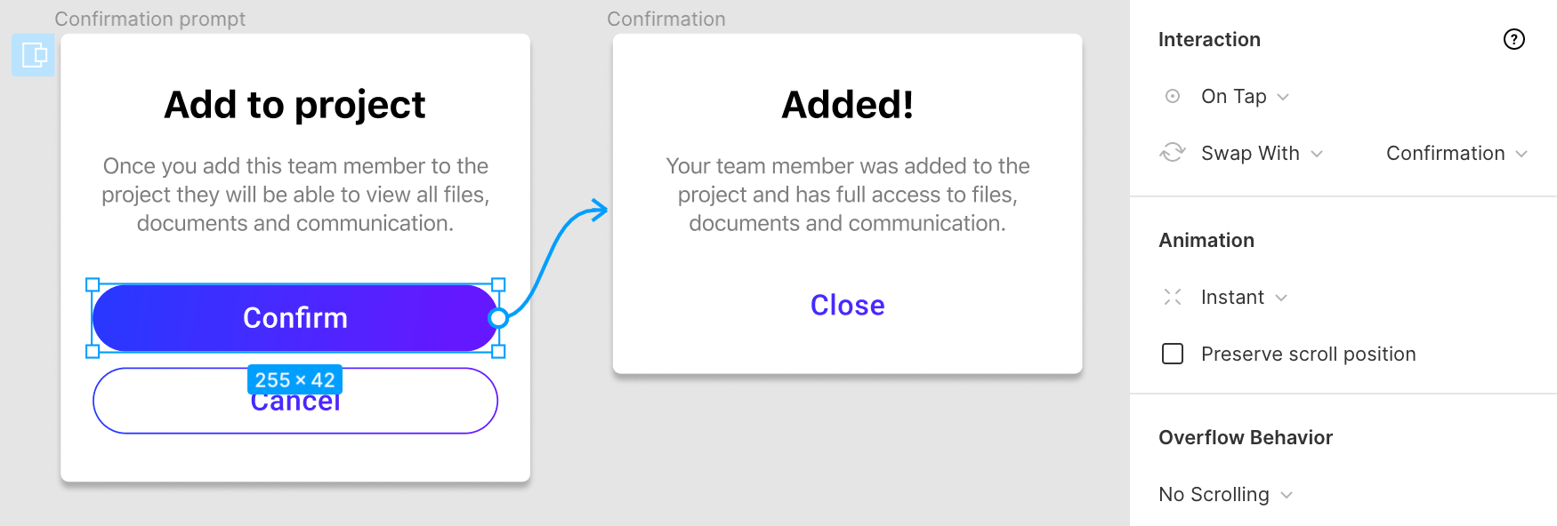
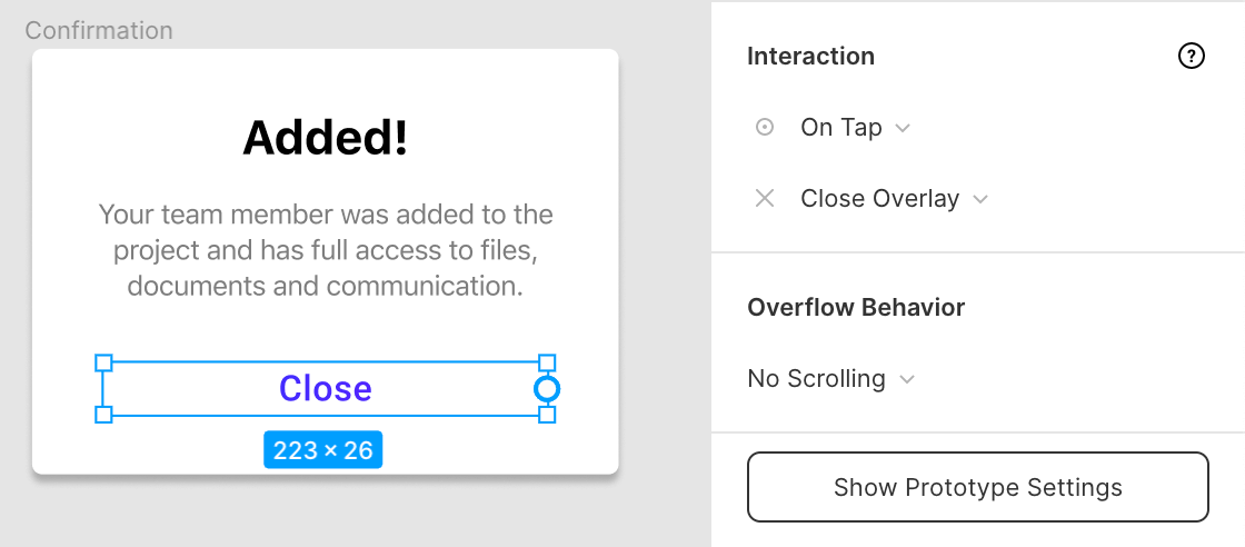
All that's left to do for the user is to close the modal. Select the 'Close' text link and use the On Tap trigger for the Close Overlay action. You can also apply this option to the 'Cancel' button in the previous step of our modal.
Conclusion
Now that you know how you can create these animations in Figma, I hope you'll spend more time thinking about them in your next project and make it easier for developers to translate your designs into working products.
Although we can create a lot of the most common animations in Figma using the techniques described above, some more complex animations can't yet be created or require many frames to get right which will clutter up your design files.
The built-in animation features of Figma cover most of the basics but fall short when you try to create more complex animations and transitions. There are some more advanced alternatives like Figmotion (Figma plugin) or Principle (external software) for these types of animations but for a lot of designers, these basics should be enough for their projects.
If you'd like help with your next project, shoot me an email:
You might also be interested in my free Figma thumbnail template or my profile banner template.